Inside the Visual Identity of Qatar Canada and Mexico 2026
2026/02/17
In 2026, Years of Culture enters a new chapter, as Qatar partners with Canada and Mexico in a landmark year of cultural exchange across North America.
Years of Culture
false
2026/02/17
The Qatar Canada and Mexico 2026 Year of Culture invites audiences to explore connections that go beyond geography and speak to shared human experience. The partnership between the three nations reflects a common belief that culture grows richer when stories, traditions and perspectives meet.
This spirit of collaboration is at the heart of the newly unveiled branding and visual identity, designed to honour each nation while telling one collective story.
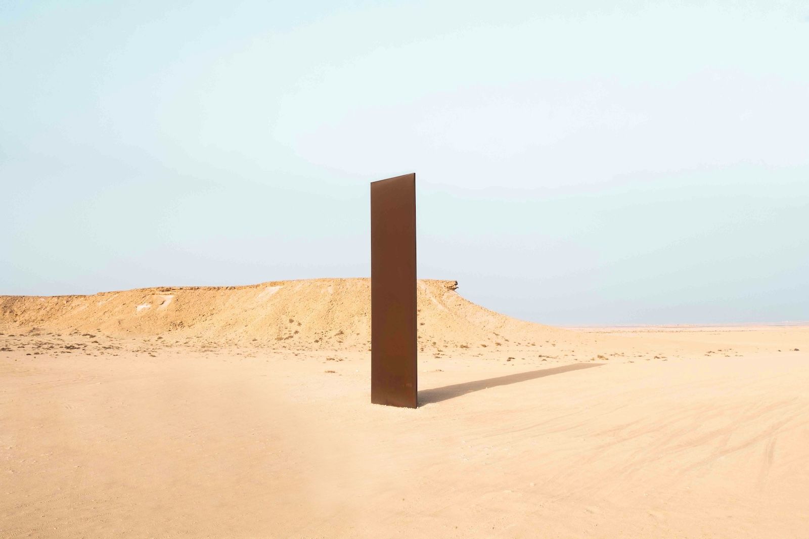
The design journey began with the three national flags. From Qatar’s distinctive flag to the Mexican tricolour and the Canadian maple leaf design, each is powerful in its own way, with a unique and fascinating history.
But when placed together, those contrasts proved difficult to translate seamlessly across one cohesive visual identity. Rather than forcing harmony between the different tones, the design process turned to nature for a common reference point.
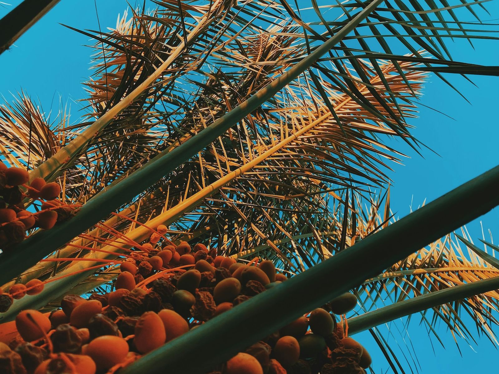
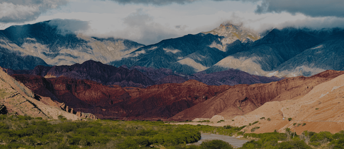
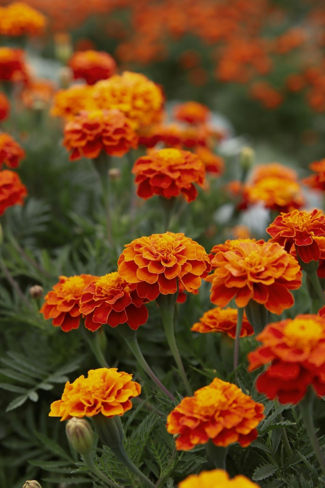
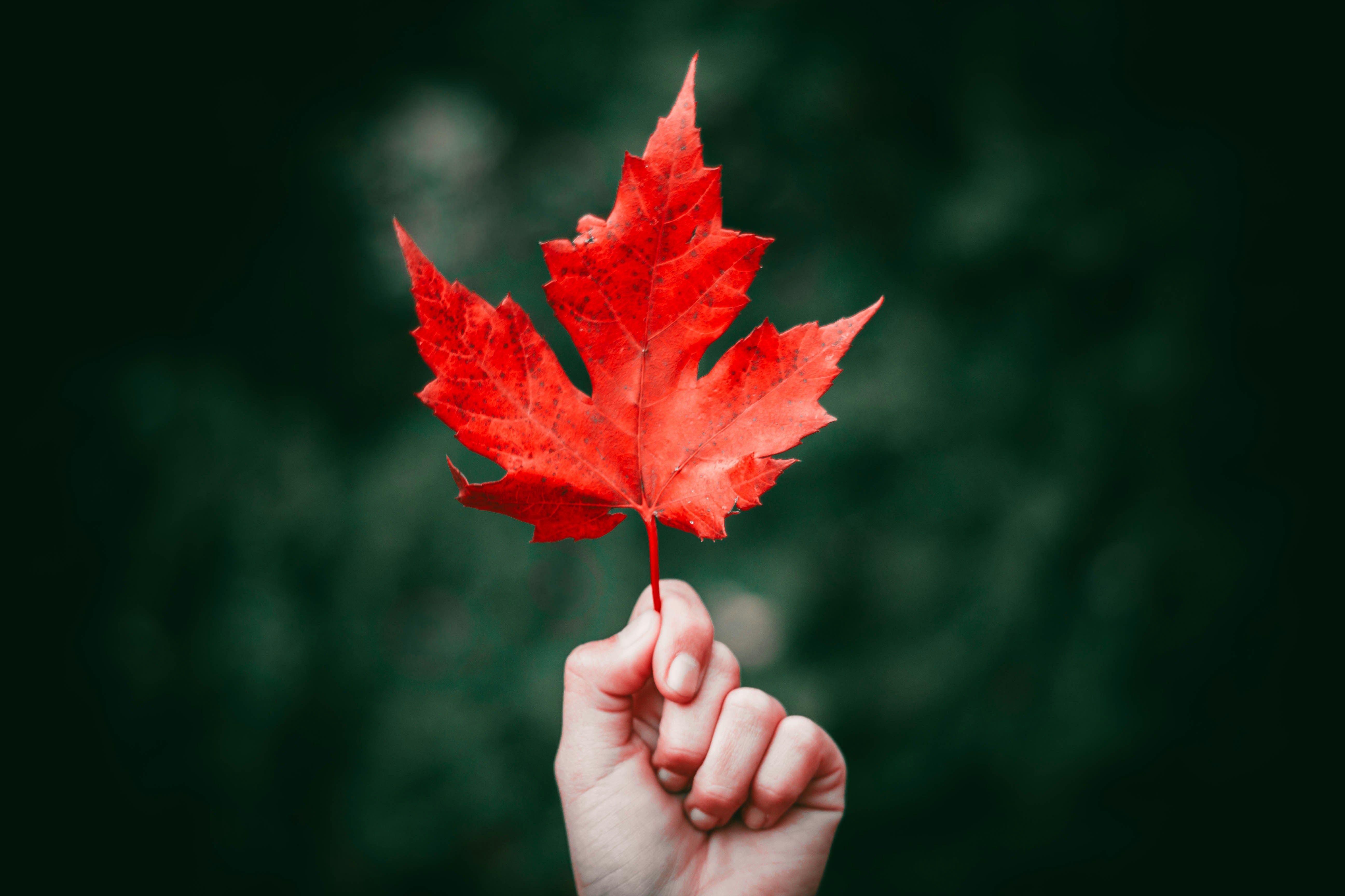
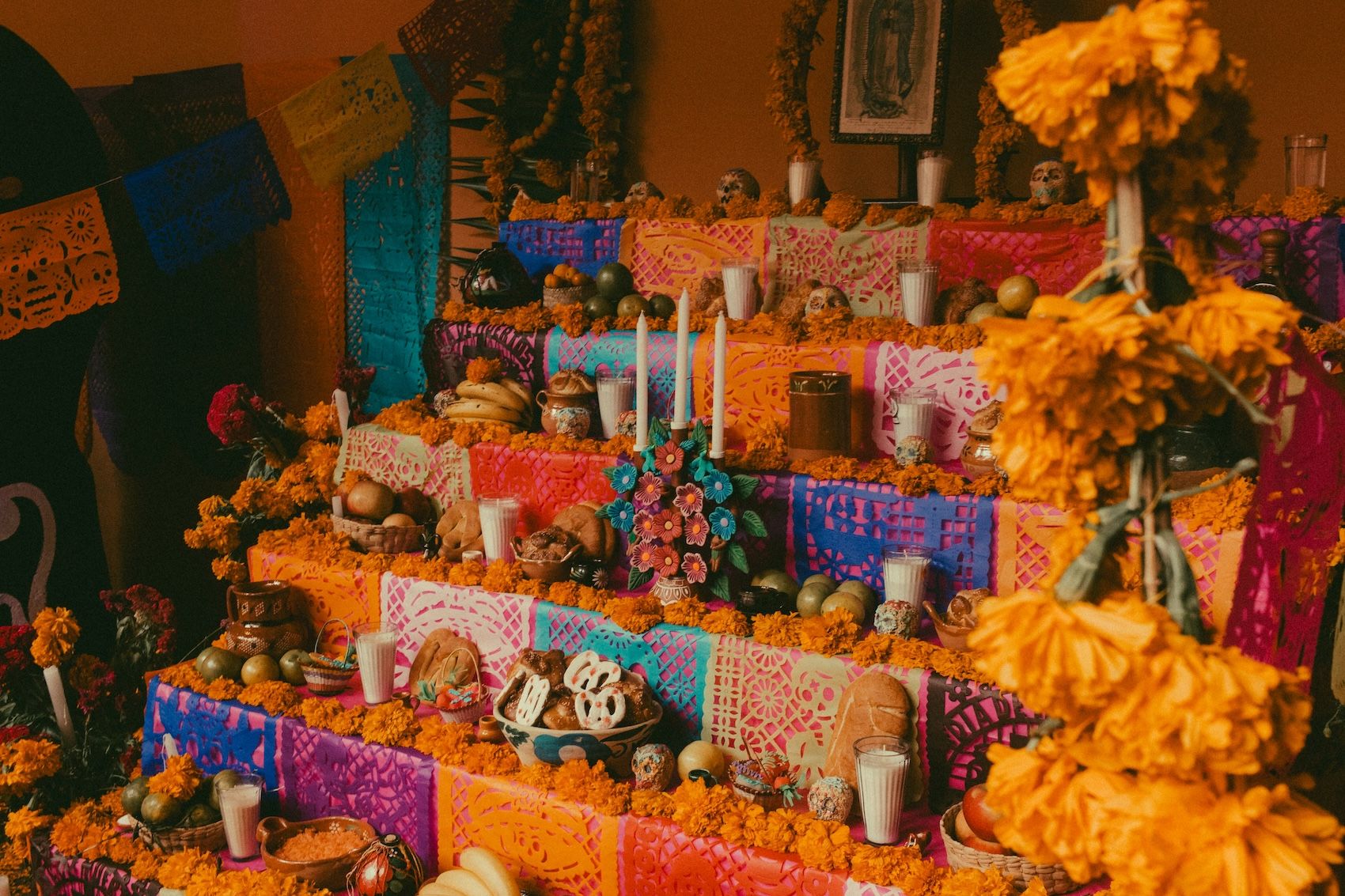
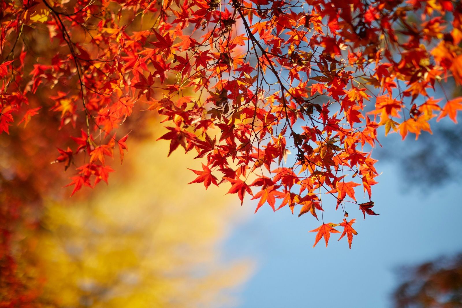
The Qatari palm, the Canadian maple, and the Mexican marigold each hold deep cultural meaning within their respective landscapes. They also share similar tonal journeys, with overlapping colours across seasons and environments.
The result is a shared visual language rooted in place, nature and everyday life. By tracing the colours through these native plants, the palette stays true to each nation’s identity while forming a warm, balanced and versatile palette for 2026.
The 2026 Year of Culture branding begins with the national colours of Qatar, Canada and Mexico, harmonised through natural, iconic elements that resonate across all three countries. The result is an aligned design that feels grounded in a strong sense of place.
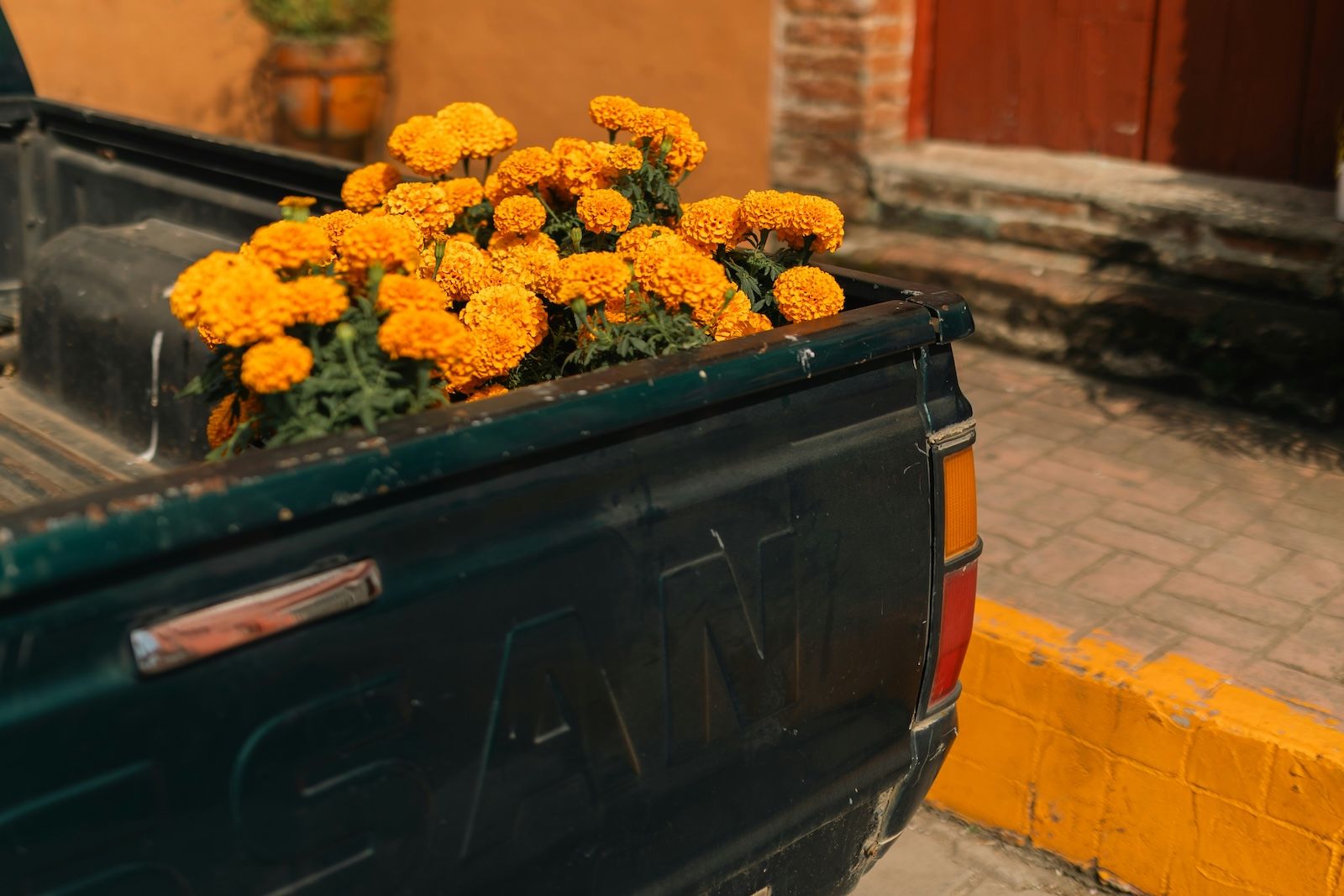
Each of the tones already exists in the colours people encounter in daily life. From date clusters in Qatar, to autumn maple leaves in Canada and marigold fields in Mexico, these colours are already familiar and resonate on an emotional level.
Because these hues are grounded in lived environments, the palette feels authentic and rooted in real places and textures while remaining accessible to global audiences. At the heart of the visual identity are four core colours:
A warm red drawn from ripe date clusters, autumn maple leaves and the heart of the marigold flower. Crimson Horizon represents shared heritage and the enduring connections linking the three cultures.
An uplifting orange inspired by sunlit dates, marigold fields and copper maple foliage. Harvest Glow expresses creativity, abundance and the idea of shared growth.
A deep green taken from palm fronds, summer maple canopies and lush marigold foliage. This shade provides balance and visual stability, anchoring the palette in a sense of continuity and calm.
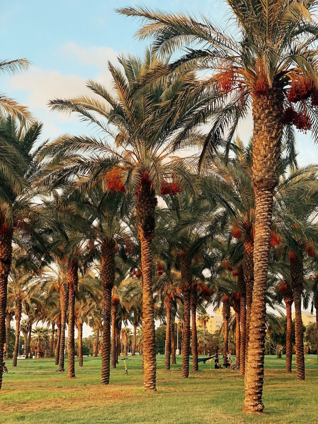
A soft ivory drawn from Qatar’s desert light and the pale tones present in the Qatari flag. It grounds the palette and acts as a unifying foundation, reflecting Qatar’s role as host nation.
The final colour combination brings together evolved tones inspired by date palm, maple, and marigold. Each hue honours its cultural roots while contributing to a bold, contemporary brand identity for 2026.
Together, these colours represent Qatar, Canada, and Mexico in equal measure, forming a single, cohesive style designed for clarity, contrast, and consistency across the Years of Culture initiative.
Throughout 2026, this identity will frame a year-long calendar of cultural events, allowing stories from all three nations to sit side by side with equal strength.
The Qatar Canada and Mexico 2026 Year of Culture is built on dialogue, exchange and shared creativity. Its visual identity reflects this ambition, rooted in local cultural references.
As the year unfolds, this palette will frame exhibitions, performances, conversations and collaborations that invite audiences to experience the connections between three nations, seen through a shared lens.
Discover upcoming events in Doha as part of the Qatar Canada and Mexico 2026 Year of Culture, and follow Years of Culture on Instagram for the latest updates and behind-the-scenes insights.